Blog 14: Chris Milk

Chris milk is from New York but went to school at the Music and Film at the University of California, Santa Barbara. He’s considered an American entrepreneur, innovator, director, photographer, and immersive artist.

He has had a very eclectic career that began with working commissions for music videos and commercials for names such as Kanye West, Johnny Cash, Nike, and Nintendo.

He works in such a vast variety of mediums, most recently Virtual Reality, and I think he is really working to push the boundaries of his own art.

This TED talk is extremely interesting because he talks about art as a whole and music as an art form, which personally I get completely. He then talks about how this translates to his art and shows some of his first music videos which I think is great because it aids in seeing his progression to now as an artist especially since he continues to work on music videos.


I can’t really attach a link other than the website, but one of my favorite things that he has done is http://www.thewildernessdowntown.com/. It is an interactive, personalized “music video” experience for the song We Used To Wait by Arcade Fire (great band). It takes the users personal information that they willingly give, like the address they grew up in and then transforms it into this trip using google map technology. It’s fantastic and so clever. The interactive aspects of it transform the properties of a music video so interestingly.


One of the music videos that he did was for Gnarls Barkley. It’s very surreal and focused on the video itself rather than the music in a lot of ways which is interesting since it is for the song. It has this feeling to it that the song itself is the background noise which is not how traditionally it is done especially in the realm of popular and current music that Gnarls Barkley fell into at the time. It’s super creepy and uses effects in a weird way that is reminiscent of his other work.



Blog 13: Pipilotti Rist

Elizabeth Charotte Rist was born in 1962 in Grabs, Sankt Gallen, in Switzerland. Since her childhood she has been nicknamed Pipilotti. The name refers to the novel Pippi Longstocking by Astrid Lindgren. She is known for her experiential video and installation art. These often portray self-portraits and singing. Her style is often considered surreal, intimate, and abstract. It is often related or focused on the presentation of the female body which is part of why her artwork is often noted as feminist art.

This is so fucking weird. It’s just a trailer for the exhibition but already it is super interesting. She is using her body as a way to create her art in this piece. The use of makeup and expression is how she explores the idea of femininity, while she’s smearing and distorting her face. This idea of messing up the makeup and the disturbing faces that she makes challenges stereotypical images of women.

The two videos on adjacent walls is an interesting idea.  The content of two videos are different but compliment each other in a really interesting way. The lush vegetation compared to the woman with sparkly shoes walking down a busy street. Then the video shifts and she begins smashing windshields. It’s whimsical and anarchistic, with a police officer approving of the destruction.  Again, this use of a soft object or traditionally non-destructive object in a way that challenges stereotypes is something I really enjoy about her work.

https://www.youtube.com/watch?v=Ks_DquEcaJI

She also directed a movie.
I didn’t have a chance to finish the whole thing  (I plan to later) but was able to watch a decent amount of it. It is so wild and surreal and very distinctly Rist as the bright colors and whimsical qualities are maintained throughout. I think the production of a full film is a lot more interesting that some of her other video art pieces. It highlights her expertise, and shows her artistry through the ability to sustain stylistically and not fall flat throughout a feature length piece.

Blog 11: Evan Roth

Evan Roth is an American artist who applies a hacker philosophy to an art practice that visualizes transient moments in public space, online and in popular culture.

Single channel video
2015

The most interesting aspect of these piece besides from the visuals is the audio. It was recorded on location and is created from a device that he built called the ‘ghost box’. It scans radio frequencies and blends the scanning radio static with ambient noises of waves and wind. This allows it to be tied to the place that it is happening. Aesthetically, the color composition of this video is very appealing and monochromatic. The pink tones overall work well with the audio. I dig it.

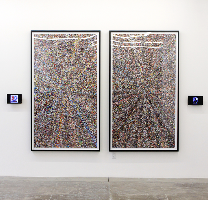
Internet Cache Portraits series
C-print face mounted on acrylic, dibond backing
2014
This series reminded me of Jason Salavon especially with the use of the internet images. However, the portrait idea is more intentional and interesting than I think a lot of Salavons work is. This is and uncensored stream of images collected through a session of Internet browsing. The series depicts individuals from different countries, occupations and genders, all rendered during the same two week period of time. These algorithmically produced prints act as a contemporary nude, exposing in a generous and open way an individual’s private online interactions. It’s weirdly not personalized and extremely personalized all at the same time.

Zoom in Zoom Out (part of)
Lambda print face mounted on acrylic, dibond backing
2014
I am so into these. The idea, the execution. I am truly intrigued by these art works and how both easy and complex they are. The use of these motions in an artistic way is recognizable and not recognizable. It’s almost indistinguishable and seems arbitrary, but the precision and the specificity of the action when it comes down to it translates in a way that makes each piece so unique. Wow. I wish I had thought of this.

Blog 10: Takeshi Murata

techniques in some prints/pictures for his galleries or exhibitions. Known for psychedelic animated videos and datamoshing. There is also a focus on sound in his video art, especially with how he chooses to implement them along side the videos.

https://www.salon94.com/artists/detail/takeshi-murata/2256

Night Moves, 2012
I couldn’t find a way to embed this video since it is a part of an official site. This one is the most appealing video of his to me, the kaleidoscope visual ideas in the beginning really visually draw me in, and then it turns into this almost hyperrealistic setting, which it’s hard to distinguish whether or not it is real or CGI. When the images start to break down, similar to many of his other works that’s where it begins to have the tonal similarities and distinct aspects that make it his art.

Monster Movie
This is so weird. He uses clips from films that already exist in order to manipulate them and it resembles glitch art in a lot of ways which I find very visually appealing in an extremely unsettling way. The most jarring aspect of this piece is the sound/music that he puts over the video. It’s seemingly demonic and the tones do not match up which creates an even more interesting effect.

Part of Synthesizers
This whole collection and series is super interesting because it seems almost realistic but almost CGI. It’s almost falls into the idea of the uncanny valley, where you can’t fully tell if it’s real or not, especially with the 3D elements and the color composition that he’s choosing to use.

Blog 9: Christian Marclay

Christian Marclay is a contemporary artist who explores the connections between visual arts, film and mass-market musical culture. His artistic process seems to have roots in sight, sound, and all variations of recordings which includes visual or otherwise. His overall body of work spans sculpture, video, photography, music, performance and collage. He works in a way that his pieces transform sounds and music into visible, physical forms throughout all the mediums that were mentioned above. One quote from him is that he’s “always been interested in how sound is visualized” which explains and shows some inspiration behind his art.

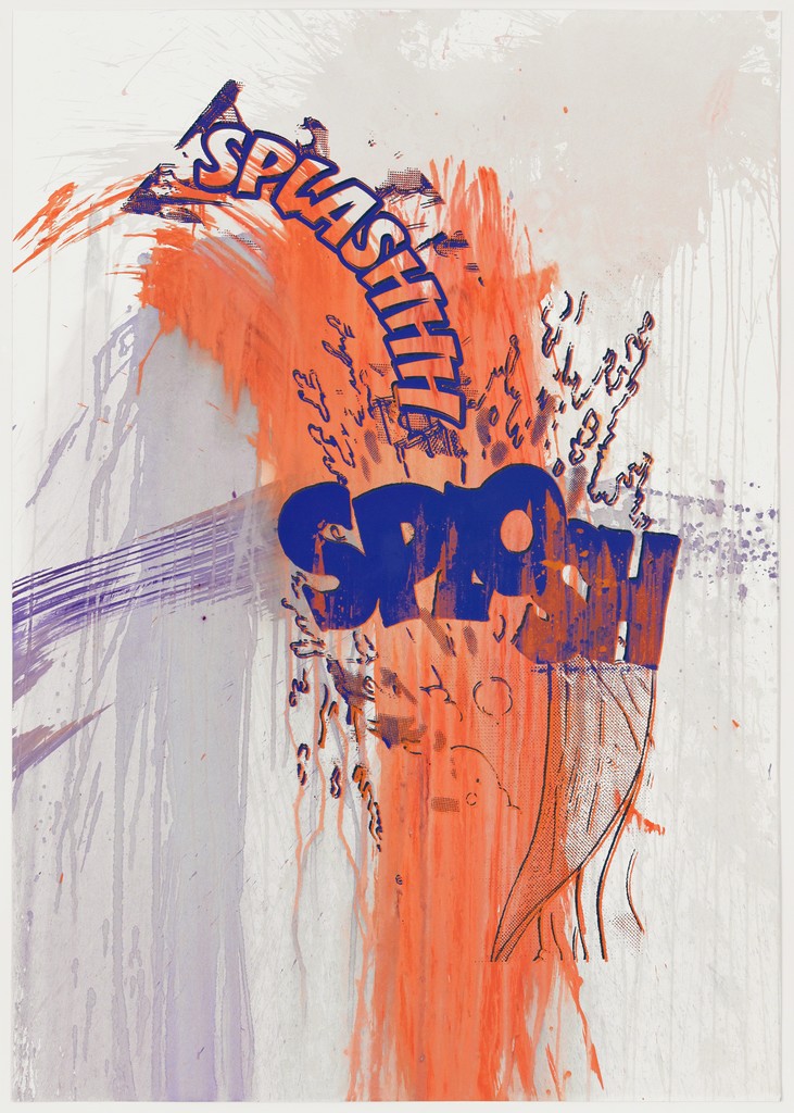
Splashhh Splosh (No. 8), 2012
This one is great because of the way it uses onomatopoeia and words visually to create the art which is an example of content matching form. The use of bright color is also very aesthetically appealing in this one, too. There’s not a lot I can comment on with this, because it’s self-explanatory. The simplicity is part of it’s appeal for me.

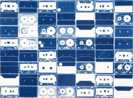
Cassette Grid No. 132009
The process that was used to create these is what struck me the most. The idea of using tapes and then creating the cyanotype phantograms out of them is such a unique thing to do, also because of the labor involved in this process which also involved dissembling the tapes themselves. There is a series of these, and this one is my favorite because it’s not as specific as some of the other one’s which are titled with the tape name. This one though, is just a grid of so many different one’s it leaves it up to the viewer to wonder what the different cassettes were that Christian chose.

October 29, 1989. On music television show Night Music. 
This is so intense and loud and wild. The use of already created music and combining all the different sounds in a way that is so indistinguishable is creative but also reckless in a weird way. The record scratching sounds and the mechanical outcomes of this to where it almost sounds like office technology gone wild. Then the transition, technically this is extremely impressive because of the seemingly precise use of each record and how he changes them out. It’s like science-fiction based with elements of mysticism in the phrases of melodies that he chooses to leave in tact before manipulating them in a jarring and dissonant way. I loved this in a way that it made me cringe but I was so entranced the whole time too.

Blog 6: Jason Salavon

Jason Salavon is an American contemporary artist. He uses computer that he has designed to manipulate and reconfigure preexisting media and data to create new visual works of fine art. He generates and reconfigures masses of communal material in an effort to present new perspectives on the familiar. His projects attempt to unearth unexpected patterns while exploring the relationship between the part and the whole or the individual and the group.

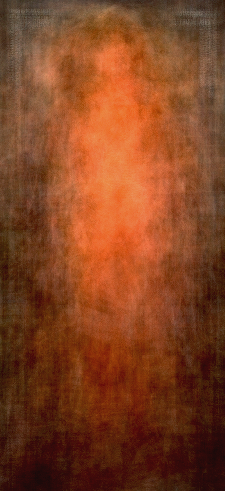
Every Playboy Centerfold

I really enjoy this because the context of knowing it is every playboy centerfold but then the way that the female body is morphed here into almost some etherial force is beautiful. It’s reminiscent of it’s original images but takes them to create something completely different.


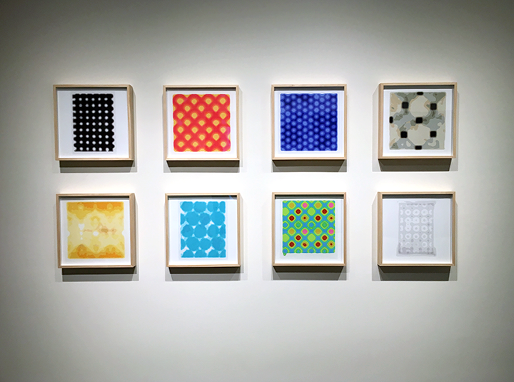
Automatic Pattern for You   2016

The way he takes photographs of things and then changes them to be digital and warps them so they’re almost unrecognizable is something i think is really cool.

Good and Evil 2012

They’re so similar but content wise so different where the differences between good and evil are so slight. Also the compilations he makes are so specific and complex. I enjoy the intent behind it, especially this concept of good vs. evil in this work.

Blog 5: Kelli Connell

Kelli Connell is a contemporary American photographer originally from Oklahoma City, OK but now lives in Chicago. She creates self-portraits which she began doing in order to explore how photography can ask the viewer questions. Some of these questions and themes that she explores throughout her photography are identity, gender roles, and the societal expectations that are put on individuals.

Her photography only depicts two figures of which she is both.

I found it hard to pick three photos, because they’re all similar in content. Which means that while I thought some are better than others, there wasn’t like a collection that spoke to me. They’re all the same project, but anyways below are the one’s that truly stuck out to me.

Bed and Breakfast- 2010
The composition/colors are amazing in this one. Just aesthetically I love the contrast between the yellow and the turquoise that is scattered around the room and then matches her towel. There is also the relationship created in this one that appeals to me. Throughout all of the photos she is able to set these intimate moments and scenes which feel so real. This one especially with the positioning sets up this intimacy. It begs the viewer to contemplate the relationship between these two. Is it romantic? Or platonic? It’s up to you.

Eden
This one stuck out to me because of the personalities created through not only the clothing but also the body language and facial expressions. Connell is a master at having different enough expressions and posture that they really seem like different people. Costuming helps, but would not be as good alone. Here we see an example of the more overt use of clothing to express femininity or lack there of in the figure with the green shirt.

Rooftop
This too is another example of the use of clothing to express gender or femininity in women. This one I particularly like because of the positioning of the bodies and action that the figures are taking. The color composition and contrast between the saturation of their clothing also aids in this. The relationship here is also very convincing and intimate.

I think I like it so much because of the way the right figure is looking at the left. It’s an expression that i feel most hope someone will look at them with one day. It seems extremely genuine feeling as if this were a candid photo, although we know it is very calculated and deliberate.

Sunset
This one is more subtle. The differences between the figures are less apparent than in previous one’s in terms of costuming. These figures are both presented pretty femininely yet have different aesthetic values causing them to still be distinct characters that she is portraying. The expressions again, are done so well. She angles her face in a way that is kind of looks like she is a different person.

She has collections from a lot of different years and I think my favorite years are the collection from 2005-2006.

Looking at her photography and this ‘double life’ project that she has done throughout the years, is a helpful way to make me aware of all the factors that goes into these photos. It’s not just about the editing. As we talked about in class, it’s also about the costuming and posture/expression. With these photos she is so meticulous and capable of portraying different characters that is is something I hope to do in mine, and make sure I pay attention to all the little details so that it is effective.

Blog 3: Cory Arcangel

Cory Arcangel was born in Buffalo, NY but according to his website currently lives in Stavanger, Norway but he works in New York. He considers himself an artist and entrepreneur. His work is made and presents itself on a wide range of media. He is an active artist and has been a part of many shows in the past. He also has a company with which he sells merchandise and designs/creates these products as well.

I enjoy the personality and online presence that he has. It’s approachable and relatable. For example he lists axl rose’s twitter as an influence. Also just the F.A.Q. on his website, he seems like a genuinely nice guy who is just doing what he loves. I am here for it.

The Lakes series  

Asshole #2// Lakes,  2014

The whole series is interesting, especially the images that are chosen to produce this Lake effect. It caught my eye initially because there was a snapchat filter that was similar and whatever you took a picture of was mirrored at the bottom of the screen. They’re also simplistic technically but again, the content of this series is what makes it worth noting and looking at.

Super Slow Tetris 

This concept was really interesting to me, where in his other 8-bit mods he had altered things to be more artistic, ex: removing everything but the clouds. Here however, the manipulation of the game itself is the art, and the time manipulation. It’s crazy to me that he alters these cartridges in the way that he does because it sounds very technically challenging.
His commentary on this project too, makes me like it better. The idea of ‘upsetting’ interactive things is one that I can get on board with. The frustration he has created through a game that is already frustrating for a lot of people? I think it’s funny and great.
(Note: He did a similar thing with space invader. He made mindlessly enjoyable games essentially unplayable and there’s almost something fascinating and metaphorical in that concept. Or maybe it’s just amusing to take the basic joy out of something? I don’t know.)

Photoshop CS: 1060 by 2744 centimeters, 10 DPC, RGB, square pixels, default gradient “Spectrum”, mousedown y=1800 x=6800, mouseup y=8800 x=20180

The collection that this piece was a part of caught my attention, because he quoted Miley Cyrus. This large scale installation is a part of “This is all so crazy, everybody seems so famous.” It is a part of the series, Photoshop Gradient Demonstrations, which I think is hilarious in the most artistic way possible. He could have very easily done this demonstration digitally and put it on a screen, but no. The title tells you exactly what it is demonstrating, and he printed it on carpet. There’s the juxtaposition too of something that is considered a digital tool within photoshop that is then transferred onto a physical object. That too gives it something to be remarked about. It’s a very simple idea but done in an interesting way that gives it more value than it would have had otherwise. If it were just a simple everyday online demonstration or image, no one would have noticed.

Blog 2: David McLeod

David McLeod is a multi disciplinary Illustrator and Artist. He is originally from Australia, but now lives and works in New York.

“His work is driven by a curiosity for exploring visual expression through CGI. With experimentation and generative methods playing a central role in his creative process, he creates 3D environments, typographic treatments and short format films.” This allows him to create very cool renderings and representations of different shapes. Some, that I personally also find unsettling since the 3D aspect causes them to have unnatural features and feelings for a viewer.

He has also worked for different companies creating advertisements, such as nike. Also has a lot of public information and knowledge out there about him. His phone number is on his website.

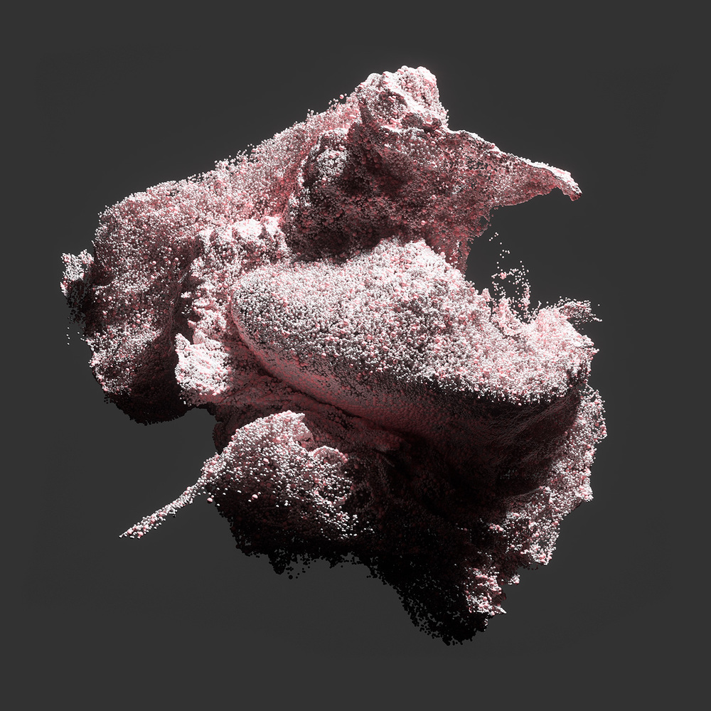
-I am in love with the Granular series of photos

The particles and effects he has created are astounding. I am so impressed and intrigued and just want to stare into it forever. The shapes he has created are almost cosmic in their explosive properties.

-I am not a fan aesthetically of the Amfursand Series — but here’s his personal favourite.

https://www.instagram.com/p/7K4rrML6oy/?taken-by=david_mcleod

Technically speaking, this is incredible. But the realistic properties, cause me to feel unsettled. This digital rendering of fur really freaks me out if i’m honest. However, that just shows how talented he is, so? I can’t hate too much.

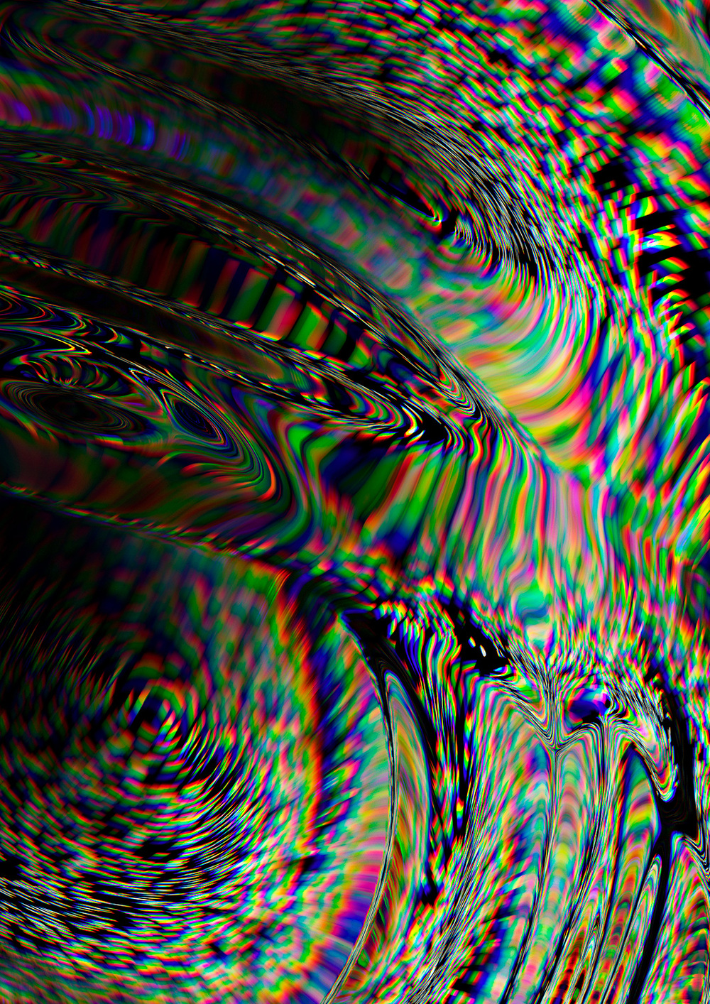
-His dispersion series deals more with optical illusion and diverges from his usual 3D effects. I enjoy this because it resembles glitch art which is a real favorite of mine. It also shows the vast capability that McLeod has. He can do more than just 3D shapes.

This artist has showed me things I didn’t know were possible with digital art, in terms of most of his works look like photographs. Especially the granular series (and amfursand series for that matter). A lot of the 3D effects and shapes that he creates in other works are obviously created on a digital platform but his skill and technical ability is phenomenal in my opinion. It’s a true example of what is possible with these tools if you work and work at it.

Blog 1: Robert Beatty

Robert Beatty is a graphic designer from Lexington, Kentucky. After looking at his website, it seems he mostly does album art for a lot of different musicians, and he is a musician himself.

His style is very surreal, and relies on some optical allusions which somehow doesn’t feel super repetitive through all of his art although they have a commonality that runs through all of them. With these optical allusions and without, he also seems to be using vary bright and contrasting colors which gives the art a psychedelic feeling. His work for the most part is extremely distinct and recognizable.

I really enjoyed this short animated video that he created, because of the comical aspect of the whoops that is formed out of the almost organic design that we see in the first frame. These structures that he is using remind me of something you’d see in a biology class but the use of color and contrast along with movement cause them to be something more that stuck out to me.


I love this. The use of space and simplicity is done in such a clean way. It reminds me of Hopper in a lot of ways with the use of space and emptiness. Or Hockney maybe just with the precision of the room itself. It intrigues me. I just want to stare at it all day. This album art for Oneohtrix Point Never’s album “R Plus Seven”.

http://payload427.cargocollective.com/1/4/158872/10844758/prt_400x400_1450454270_2x.jpg

I think the 3D, almost fluid looking shapes he creates are one of the most characteristic and uniquely him things he does. However, personally i’m not really into that. It’s relation to reality makes me slightly uncomfortable because they’re definitely graphically created but the dimension gives them an eerily realistic tinge to it. It shows a lot of technical ability in terms of creating these forms (although to be honest I have no clue how hard it would be).

I was kinda taken aback just scrolling through the front page of his website, and realized I have never looked at who does the album art for a ton of musicians that I enjoy. Turns out Robert Beatty has made a lot of them.