Blog 6: Jason Salavon

Jason Salavon is an American contemporary artist. He uses computer that he has designed to manipulate and reconfigure preexisting media and data to create new visual works of fine art. He generates and reconfigures masses of communal material in an effort to present new perspectives on the familiar. His projects attempt to unearth unexpected patterns while exploring the relationship between the part and the whole or the individual and the group.

Every Playboy Centerfold

I really enjoy this because the context of knowing it is every playboy centerfold but then the way that the female body is morphed here into almost some etherial force is beautiful. It’s reminiscent of it’s original images but takes them to create something completely different.


Automatic Pattern for You   2016

The way he takes photographs of things and then changes them to be digital and warps them so they’re almost unrecognizable is something i think is really cool.

Good and Evil 2012

They’re so similar but content wise so different where the differences between good and evil are so slight. Also the compilations he makes are so specific and complex. I enjoy the intent behind it, especially this concept of good vs. evil in this work.

Blog 5: Kelli Connell

Kelli Connell is a contemporary American photographer originally from Oklahoma City, OK but now lives in Chicago. She creates self-portraits which she began doing in order to explore how photography can ask the viewer questions. Some of these questions and themes that she explores throughout her photography are identity, gender roles, and the societal expectations that are put on individuals.

Her photography only depicts two figures of which she is both.

I found it hard to pick three photos, because they’re all similar in content. Which means that while I thought some are better than others, there wasn’t like a collection that spoke to me. They’re all the same project, but anyways below are the one’s that truly stuck out to me.

Bed and Breakfast- 2010
The composition/colors are amazing in this one. Just aesthetically I love the contrast between the yellow and the turquoise that is scattered around the room and then matches her towel. There is also the relationship created in this one that appeals to me. Throughout all of the photos she is able to set these intimate moments and scenes which feel so real. This one especially with the positioning sets up this intimacy. It begs the viewer to contemplate the relationship between these two. Is it romantic? Or platonic? It’s up to you.

Eden
This one stuck out to me because of the personalities created through not only the clothing but also the body language and facial expressions. Connell is a master at having different enough expressions and posture that they really seem like different people. Costuming helps, but would not be as good alone. Here we see an example of the more overt use of clothing to express femininity or lack there of in the figure with the green shirt.

Rooftop
This too is another example of the use of clothing to express gender or femininity in women. This one I particularly like because of the positioning of the bodies and action that the figures are taking. The color composition and contrast between the saturation of their clothing also aids in this. The relationship here is also very convincing and intimate.

I think I like it so much because of the way the right figure is looking at the left. It’s an expression that i feel most hope someone will look at them with one day. It seems extremely genuine feeling as if this were a candid photo, although we know it is very calculated and deliberate.

Sunset
This one is more subtle. The differences between the figures are less apparent than in previous one’s in terms of costuming. These figures are both presented pretty femininely yet have different aesthetic values causing them to still be distinct characters that she is portraying. The expressions again, are done so well. She angles her face in a way that is kind of looks like she is a different person.

She has collections from a lot of different years and I think my favorite years are the collection from 2005-2006.

Looking at her photography and this ‘double life’ project that she has done throughout the years, is a helpful way to make me aware of all the factors that goes into these photos. It’s not just about the editing. As we talked about in class, it’s also about the costuming and posture/expression. With these photos she is so meticulous and capable of portraying different characters that is is something I hope to do in mine, and make sure I pay attention to all the little details so that it is effective.

Blog 3: Cory Arcangel

Cory Arcangel was born in Buffalo, NY but according to his website currently lives in Stavanger, Norway but he works in New York. He considers himself an artist and entrepreneur. His work is made and presents itself on a wide range of media. He is an active artist and has been a part of many shows in the past. He also has a company with which he sells merchandise and designs/creates these products as well.

I enjoy the personality and online presence that he has. It’s approachable and relatable. For example he lists axl rose’s twitter as an influence. Also just the F.A.Q. on his website, he seems like a genuinely nice guy who is just doing what he loves. I am here for it.

The Lakes series  

Asshole #2// Lakes,  2014

The whole series is interesting, especially the images that are chosen to produce this Lake effect. It caught my eye initially because there was a snapchat filter that was similar and whatever you took a picture of was mirrored at the bottom of the screen. They’re also simplistic technically but again, the content of this series is what makes it worth noting and looking at.

Super Slow Tetris 

This concept was really interesting to me, where in his other 8-bit mods he had altered things to be more artistic, ex: removing everything but the clouds. Here however, the manipulation of the game itself is the art, and the time manipulation. It’s crazy to me that he alters these cartridges in the way that he does because it sounds very technically challenging.
His commentary on this project too, makes me like it better. The idea of ‘upsetting’ interactive things is one that I can get on board with. The frustration he has created through a game that is already frustrating for a lot of people? I think it’s funny and great.
(Note: He did a similar thing with space invader. He made mindlessly enjoyable games essentially unplayable and there’s almost something fascinating and metaphorical in that concept. Or maybe it’s just amusing to take the basic joy out of something? I don’t know.)

Photoshop CS: 1060 by 2744 centimeters, 10 DPC, RGB, square pixels, default gradient “Spectrum”, mousedown y=1800 x=6800, mouseup y=8800 x=20180

The collection that this piece was a part of caught my attention, because he quoted Miley Cyrus. This large scale installation is a part of “This is all so crazy, everybody seems so famous.” It is a part of the series, Photoshop Gradient Demonstrations, which I think is hilarious in the most artistic way possible. He could have very easily done this demonstration digitally and put it on a screen, but no. The title tells you exactly what it is demonstrating, and he printed it on carpet. There’s the juxtaposition too of something that is considered a digital tool within photoshop that is then transferred onto a physical object. That too gives it something to be remarked about. It’s a very simple idea but done in an interesting way that gives it more value than it would have had otherwise. If it were just a simple everyday online demonstration or image, no one would have noticed.

Blog 2: David McLeod

David McLeod is a multi disciplinary Illustrator and Artist. He is originally from Australia, but now lives and works in New York.

“His work is driven by a curiosity for exploring visual expression through CGI. With experimentation and generative methods playing a central role in his creative process, he creates 3D environments, typographic treatments and short format films.” This allows him to create very cool renderings and representations of different shapes. Some, that I personally also find unsettling since the 3D aspect causes them to have unnatural features and feelings for a viewer.

He has also worked for different companies creating advertisements, such as nike. Also has a lot of public information and knowledge out there about him. His phone number is on his website.

-I am in love with the Granular series of photos

The particles and effects he has created are astounding. I am so impressed and intrigued and just want to stare into it forever. The shapes he has created are almost cosmic in their explosive properties.

-I am not a fan aesthetically of the Amfursand Series — but here’s his personal favourite.

https://www.instagram.com/p/7K4rrML6oy/?taken-by=david_mcleod

Technically speaking, this is incredible. But the realistic properties, cause me to feel unsettled. This digital rendering of fur really freaks me out if i’m honest. However, that just shows how talented he is, so? I can’t hate too much.

-His dispersion series deals more with optical illusion and diverges from his usual 3D effects. I enjoy this because it resembles glitch art which is a real favorite of mine. It also shows the vast capability that McLeod has. He can do more than just 3D shapes.

This artist has showed me things I didn’t know were possible with digital art, in terms of most of his works look like photographs. Especially the granular series (and amfursand series for that matter). A lot of the 3D effects and shapes that he creates in other works are obviously created on a digital platform but his skill and technical ability is phenomenal in my opinion. It’s a true example of what is possible with these tools if you work and work at it.

Project 1: Logo

Here are the three different variations:


I created my logo for my website, LazyLark.com, which digiart is a subdomain of.

I began by using shapes to create the basic couch outline. Then I used a general picture of a bird I found on wikihow (how to keep your Cockatiel happy) and traced the body and wings using a combination of the paintbrush and pen tool.  I went in after I had the basic shapes and changed it using the eraser and paintbrush tool to alter the features to be that of a Lark Finch. I then filled in the colors using the paintbrush tool and the paint bucket and colored it how I wanted. To make the different variation of the designs I used the edit colors command to recolor the artwork in different ways. For the one with text I used the type on a path tool. For the third one with the colorful couch I used the stain-glass texture to add dimension to the couch.


Blog 1: Robert Beatty

Robert Beatty is a graphic designer from Lexington, Kentucky. After looking at his website, it seems he mostly does album art for a lot of different musicians, and he is a musician himself.

His style is very surreal, and relies on some optical allusions which somehow doesn’t feel super repetitive through all of his art although they have a commonality that runs through all of them. With these optical allusions and without, he also seems to be using vary bright and contrasting colors which gives the art a psychedelic feeling. His work for the most part is extremely distinct and recognizable.

I really enjoyed this short animated video that he created, because of the comical aspect of the whoops that is formed out of the almost organic design that we see in the first frame. These structures that he is using remind me of something you’d see in a biology class but the use of color and contrast along with movement cause them to be something more that stuck out to me.


I love this. The use of space and simplicity is done in such a clean way. It reminds me of Hopper in a lot of ways with the use of space and emptiness. Or Hockney maybe just with the precision of the room itself. It intrigues me. I just want to stare at it all day. This album art for Oneohtrix Point Never’s album “R Plus Seven”.

http://payload427.cargocollective.com/1/4/158872/10844758/prt_400x400_1450454270_2x.jpg

I think the 3D, almost fluid looking shapes he creates are one of the most characteristic and uniquely him things he does. However, personally i’m not really into that. It’s relation to reality makes me slightly uncomfortable because they’re definitely graphically created but the dimension gives them an eerily realistic tinge to it. It shows a lot of technical ability in terms of creating these forms (although to be honest I have no clue how hard it would be).

I was kinda taken aback just scrolling through the front page of his website, and realized I have never looked at who does the album art for a ton of musicians that I enjoy. Turns out Robert Beatty has made a lot of them.

Introduction

To me, digital art is anything that involves artistic effort and has any hint of digital aspects in it’s creation. I see the definition is extremely broad, because it could be a painting that a photo is taken of and then digitally manipulated or it could be something that is created wholly through digital means like photoshop. Although, I am sitting here thinking about it and the argument could be made that photos themselves are digital art, because you are using a piece of technology to capture it? So for example it’s a digital camera. If you use a digital camera, inherently maybe then it’s digital art? I don’t think there are strict parameters on what could be defined as digital art.

The limitations I think are the platforms that most of them exist on. You can print out images large scale to display similar to paintings, but some of the other forms of digital art such as videos and gifs exist on a plane that while easily shareable in our every internet centric world, they cannot be displayed or valued in the same way as traditional fine art. Compared to looking at a painting in an art museum from my observations, people are less likely to sit down and watch a whole 15 minute digital art piece.
But also the possibilities are endless. It breaks down so many different traditional capabilities that art has and brings in new things that artists can do. As we mentioned in class, you can use the tools how they’re supposed to be used but when you misuse it, you can create even more amazing things.

Personal aesthetic-
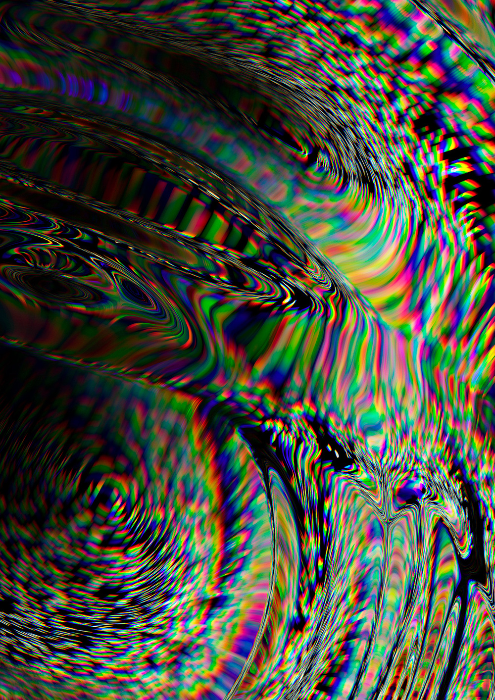
I really appreciate glitch art. This is by my friend Ivona Moro. 


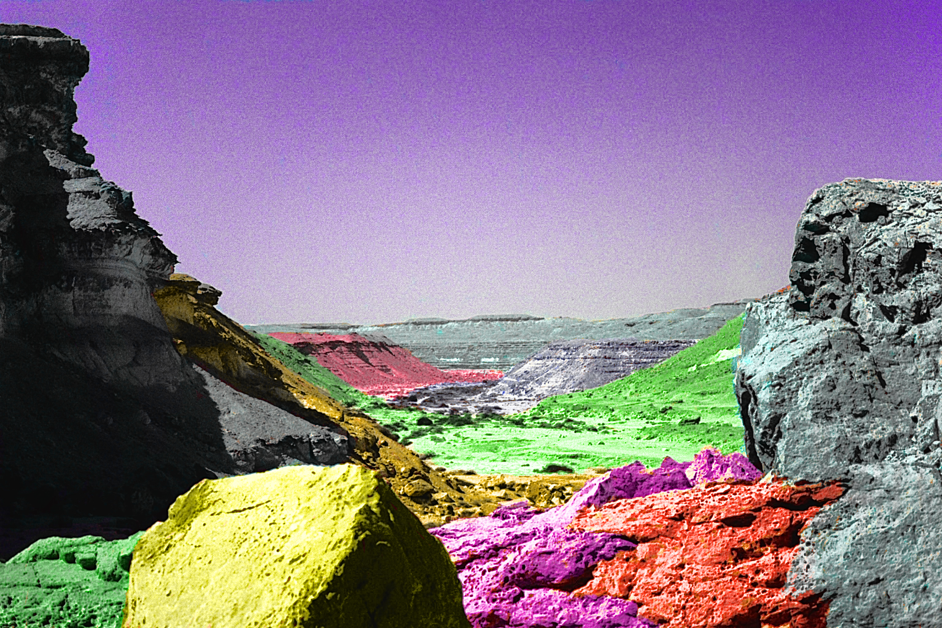
Glitch art appeals to me because it is, it’s taking something that is considered a defect or error and focusing on it, and altering it deliberately in a way that is interesting or aesthetically pleasing.

The next thing that came to mind when thinking about digital art that I enjoy is animated stills. They’re gifs, but the juxtaposition between the still image and the moving image is something that I find really great. Here’s one example that I found while researching for this assignment:

This can also take other forms though, which creates more of a 3D gif effect… I don’t actually know how these are created but this one is by my friend Jingyu Lin.  (I can’t imbed the image for some reason)

http://www.jingyulin.com/3d-gifs/4m11w84d7ik8fzh93m3ik3r2xbrl48

In my head it’s like a photo taken from different angles which would cause it to be considered an animated still? But also maybe it’s a video then turned into a gif. I don’t know. But I find them great. The movement in a lot of ways is jarring and eery because it appears as a photo initially but the moving aspect is kind of out of place.

Hmmm, i don’t know if that counts as three because while the two are so different they’re both gifs, so I’ll include one more.

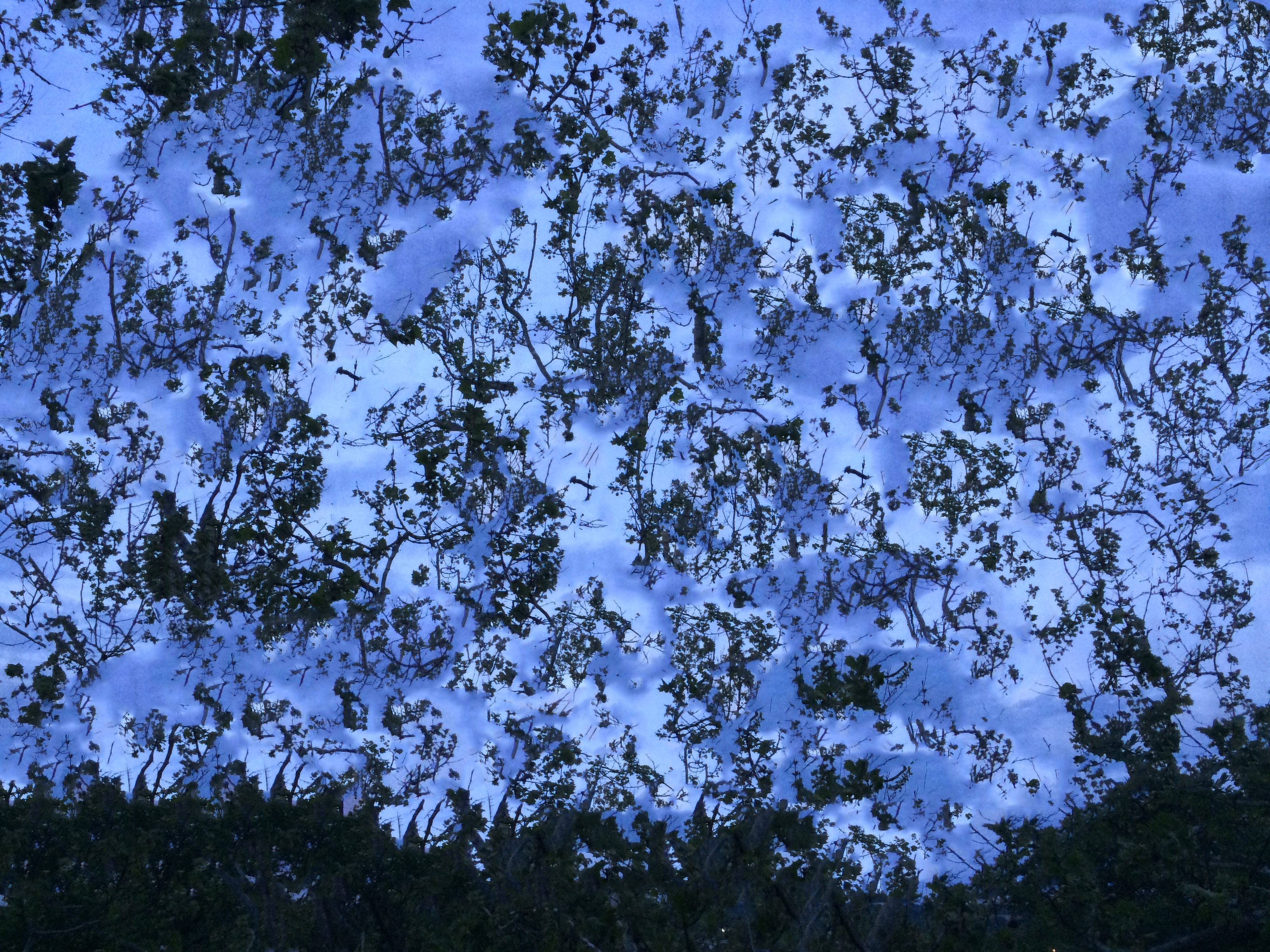
I enjoy images like this which is two images edited to emulate the effect of double exposure. It’s just two images integrated together most likely using photoshop. This is one I found while researching for this assignment, by Dan Mountford


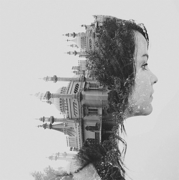
I like these because they’re a reference to the past practice of double exposure with film, which created some super cool and surreal images in a much more authentic and organic way. (Not that using digital tools makes it less credible? I don’t think that, it’s just different.) This ability to build on this technique, and perfect it through digital means really appeals to me.